Imaginable Ink
Brand & Logo Design
Kate Maria Languages is an established online language school built through years of dedicated teaching and community growth. As the business evolved, the founder, Kate, planned to launch a new offering alongside it, with its own distinctive brand identity.
‘Imaginable Ink’ needed a brand identity that would deeply reflect a thoughtful, more tactile, human approach to online language learning. The idea was to stand apart from the polished but often impersonal feel of many digital education brands. The language courses are for GCSE and A-Level students, so we needed to have an appeal to this age group and their parents.
Online Service – Human Design
The online education industry had experienced significant change, with major competitors closing their doors. This created an opportunity for ‘Imaginable Ink’ to position itself differently — not as another mass-market language platform, but as a bespoke, student-focused learning experience.
Kate’s concept combines digital learning with traditional pen-and-paper methods to encourage deeper focus, stronger retention, and more meaningful exam preparation. The challenge was to translate this philosophy into a strategic brand identity that communicated trust, creativity, and individuality.
At the heart of the brand is a celebration of books, handwriting, and analogue learning — bringing a tactile, real-world element back into online education. Future collaborations with independent bookshops also played an important role in shaping the brand direction, reinforcing the idea of learning as an immersive and thoughtful experience rather than purely screen-based.
The branding needed to feel educational without becoming overly academic, creative without losing professionalism, and premium while still remaining warm and approachable.


Human Design Solution
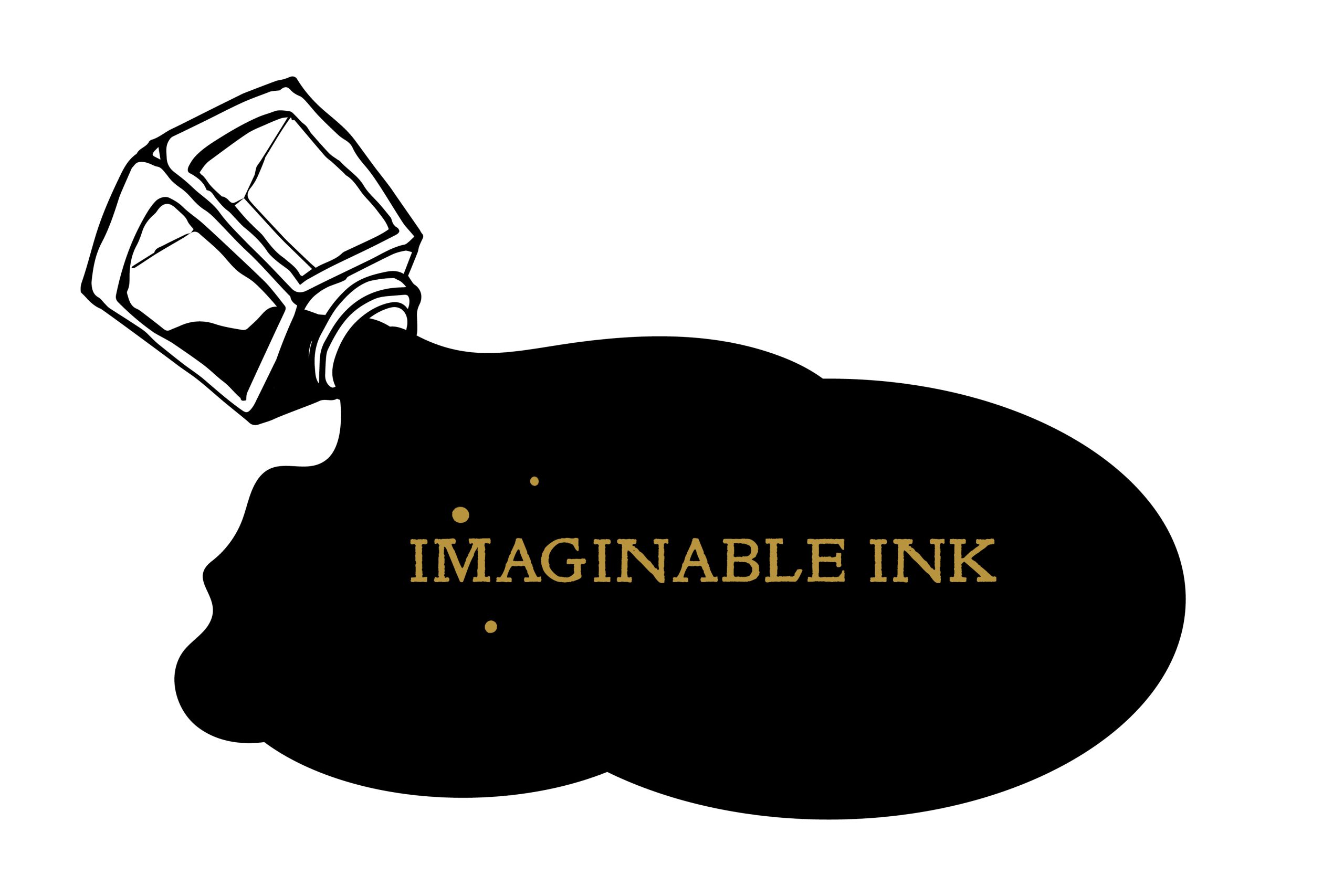
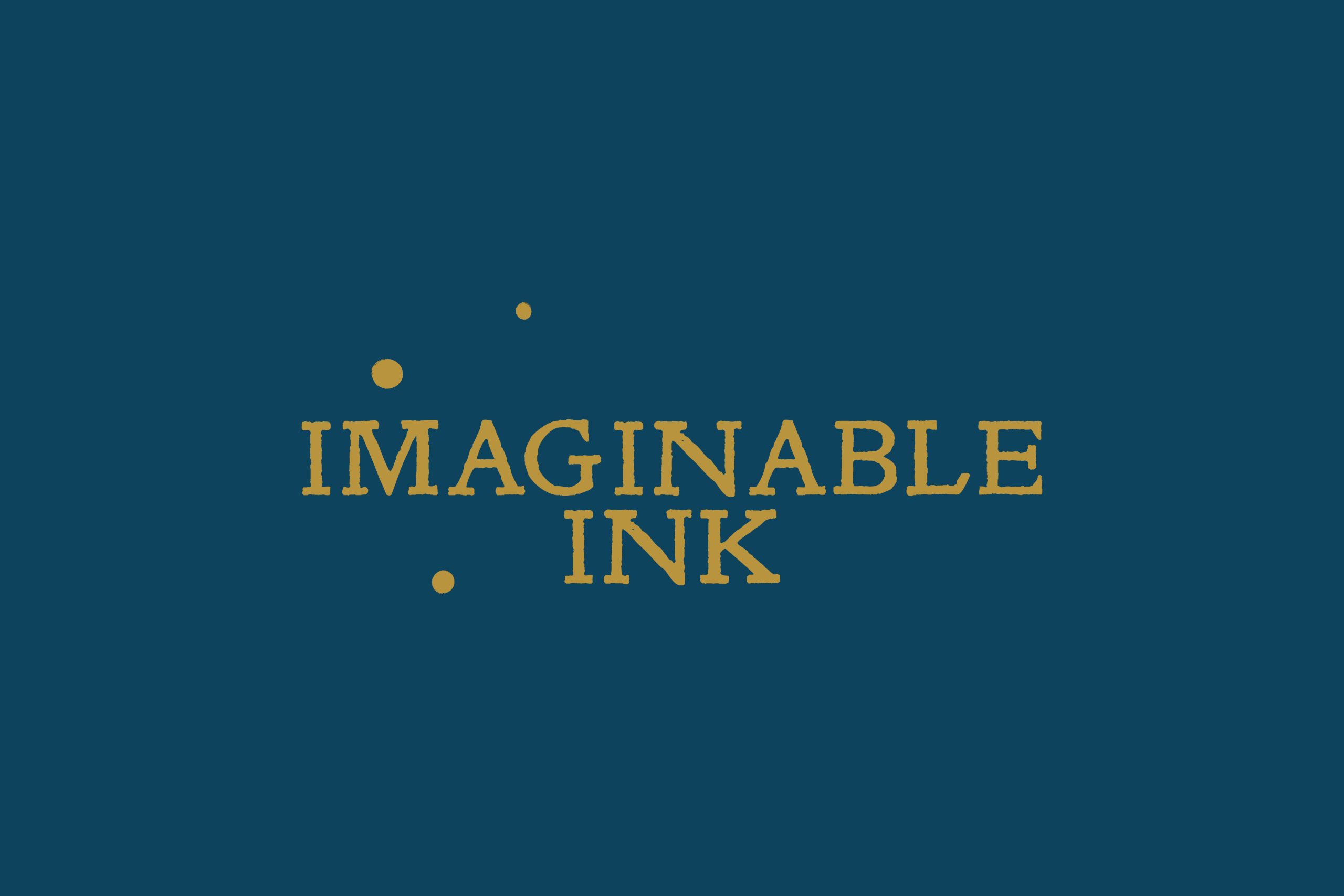
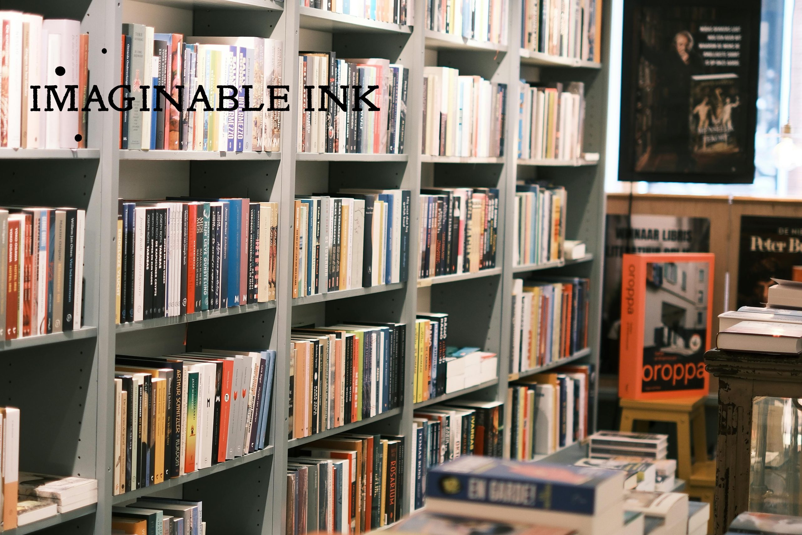
I developed a bespoke brand identity inspired by traditional publishing, travel, and the enduring craft of writing. The logo uses a classic serif typeface with a textured, printed feel, helping the brand feel established, literary, and timeless.
Subtle nautical references were woven throughout the visual identity to reflect themes of travel, exploration, and language learning. The three ink drops within the logo carry hidden symbolism: their positioning references three of the brightest stars in the night sky, creating a quiet connection to navigation and discovery.
Every visual asset was hand-drawn, including the custom brand icon. The icon was designed to work on multiple levels — representing both a pen nib and a drop of ink, while also functioning as a location pin. This flexibility allows the identity system to work naturally across printed materials, social content, and future map or location-based touchpoints.
Beneath the main icon sit three curved lines, symbolising digital connection and online learning. This balance between analogue craftsmanship and modern accessibility became a defining part of the brand strategy.
The final visual identity positions Imaginable Ink as a thoughtful, premium alternative within online education — one rooted in creativity, personal connection, and meaningful learning experiences.

Jo is an incredibly talented designer who has turned an idea into a fully developed and cohesive vision. The whole project has been seamless from start to finish, with excellent communication throughout.
Thank you, Jo!
Kate Maria
Founder of ‘Imaginable Ink’