Bizzy Bee VA
Brand & Logo Design
Erin the founder of Bizzy Bee VA, was celebrating 6 years in business and looking to rebrand. She wanted her business identity to feel more in line with the amazing business she had built and reflect her fun personality. Erin works with creatives who are looking for a myriad of admin support.
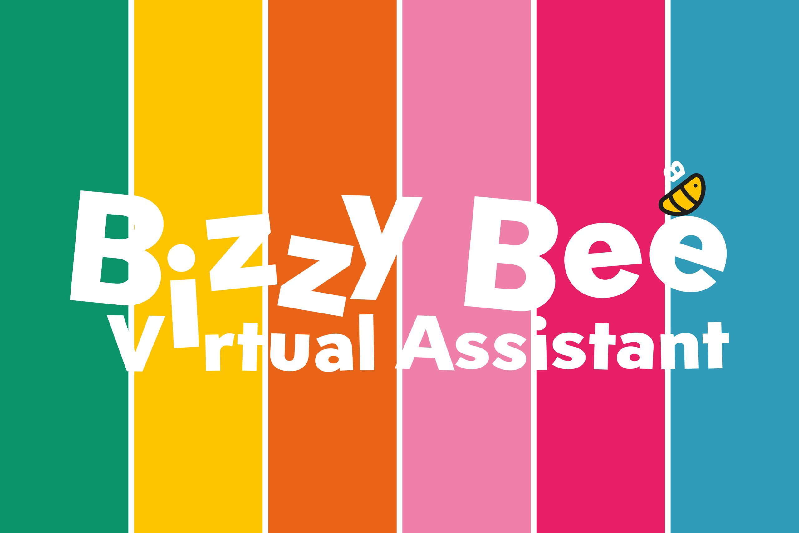
To attract her ideal clients, we wanted lots of colour, fun, energy and we couldn’t leave out her signature dungarees!
Erin has been supporting creative freelancers for several years now, creating socials and other supportive materials for her clients, which meant she was very aware of the difference great branding assets can make to the running and marketing of a business.
Professional Service – Creative Design
This was such a fun project to work on; however, the challenge was balance. I needed to create a fun brand identity – think a ‘rainbow palette’, Bee detailing and quirky drawings – whilst maintaining a professional and modern feel.
Some of Erin’s previous brand colours were heavy; we needed bright and cheerful colours that lifted the branding. While I knew Erin’s creative clients would love bold, colourful branding, it was also important to ensure the identity didn’t become overwhelming. The brand needed to include the appropriate use of white space and clear lettering to prevent it becoming too busy.
Design Solution
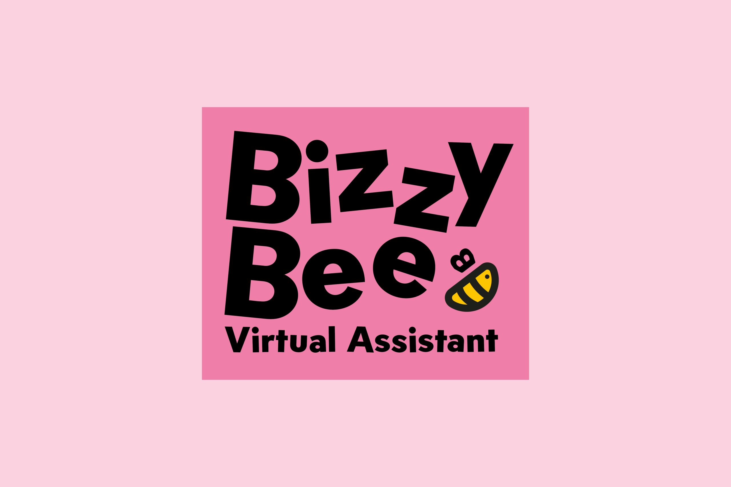
I chose to stay away from a multi-coloured logo, I always kept logos clean and adaptable, allowing the supporting brand colour palette, and assets to bring layers of colour. This approach ensures the logo remains clear, legible and flexible.
Careful typography choices ensured the brand remained contemporary, with the feeling of energy and movement, again lining back to the movements of a Bee.
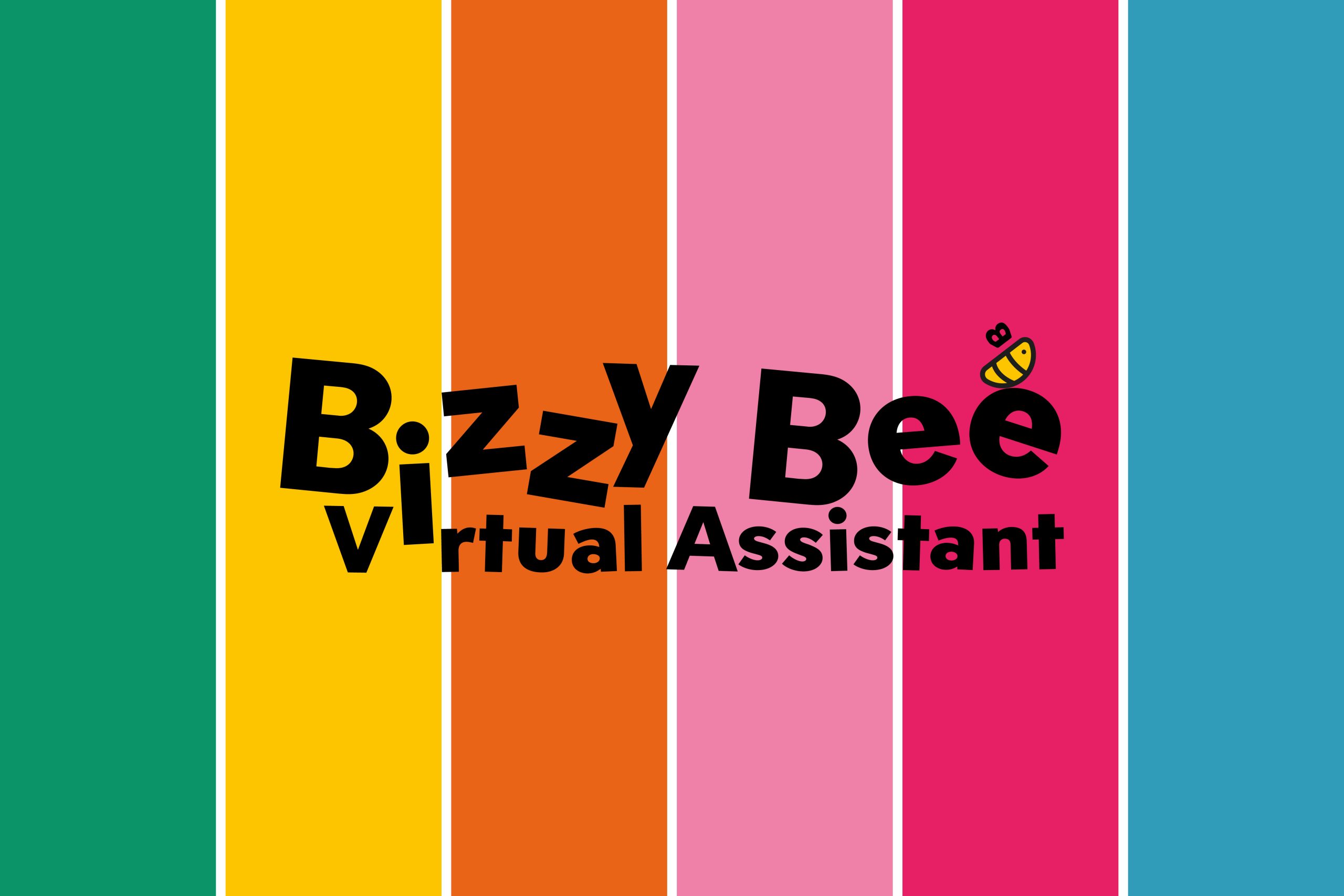
Not every colour of the rainbow is needed to create the ‘feel’ of a rainbow. The colour palette I chose features core brand colours as warm honey yellow (linking to the Bee theme) alongside bright pink. I then developed the complementary colours in the right tones to create versatility of use. The result is bright and happy but not heavy and overwhelming.
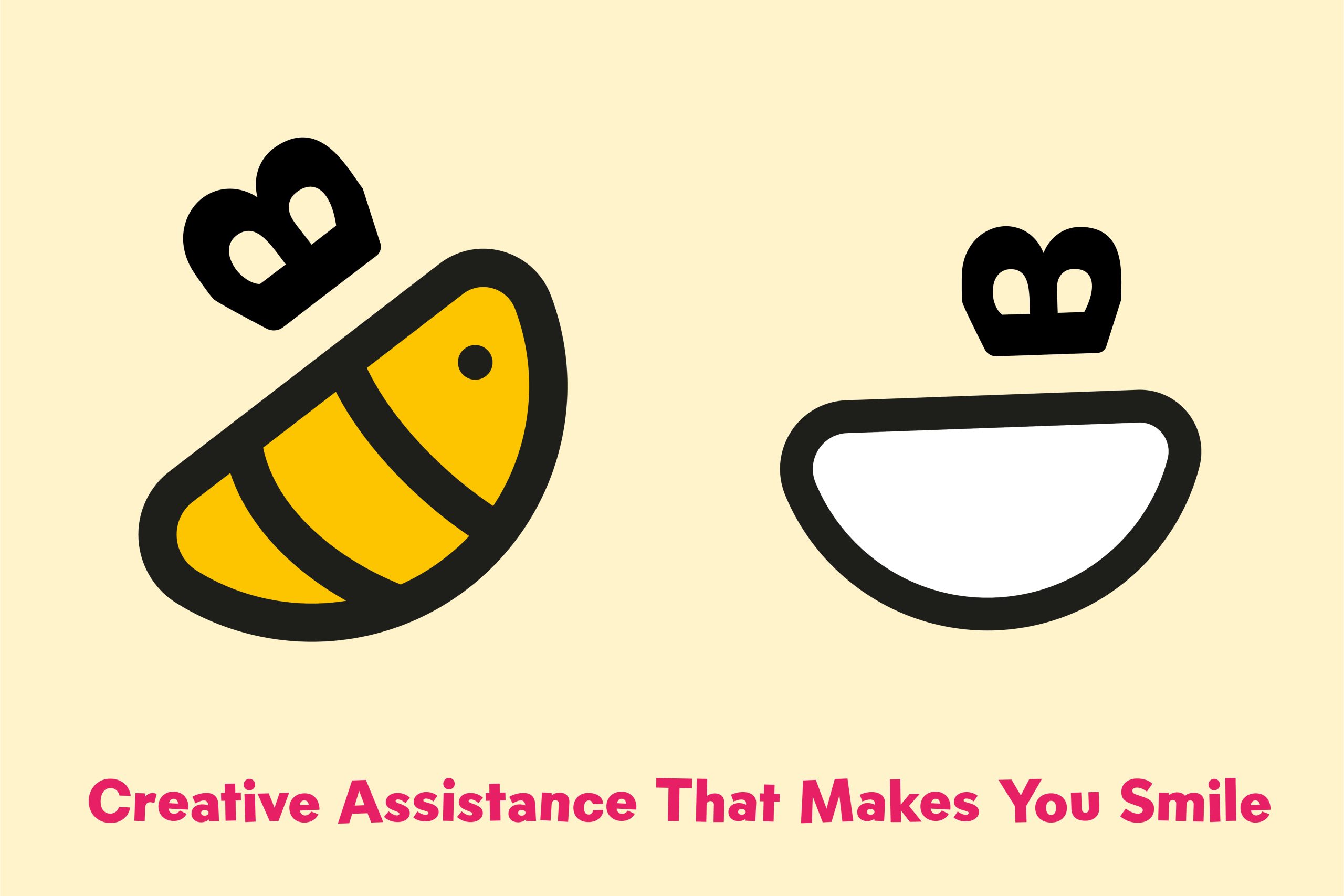
A bespoke bee icon became the centrepiece of the identity. By subtly incorporating a smile into the illustration, the mark communicates friendliness and happiness while also creating a secondary brand asset that can be used independently throughout marketing materials.
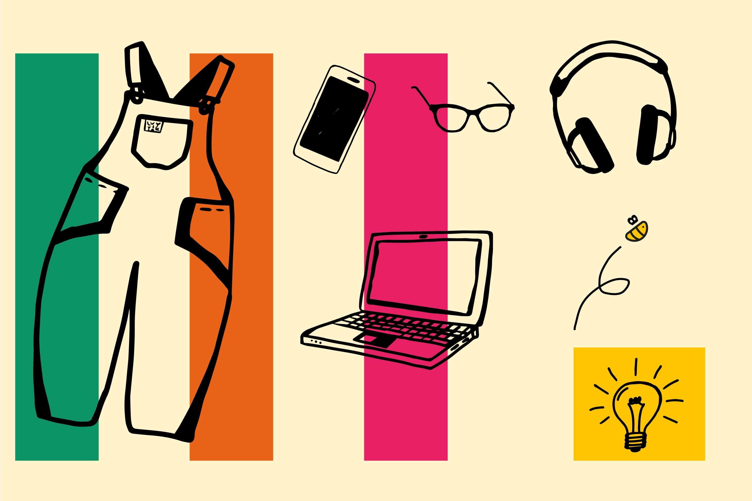
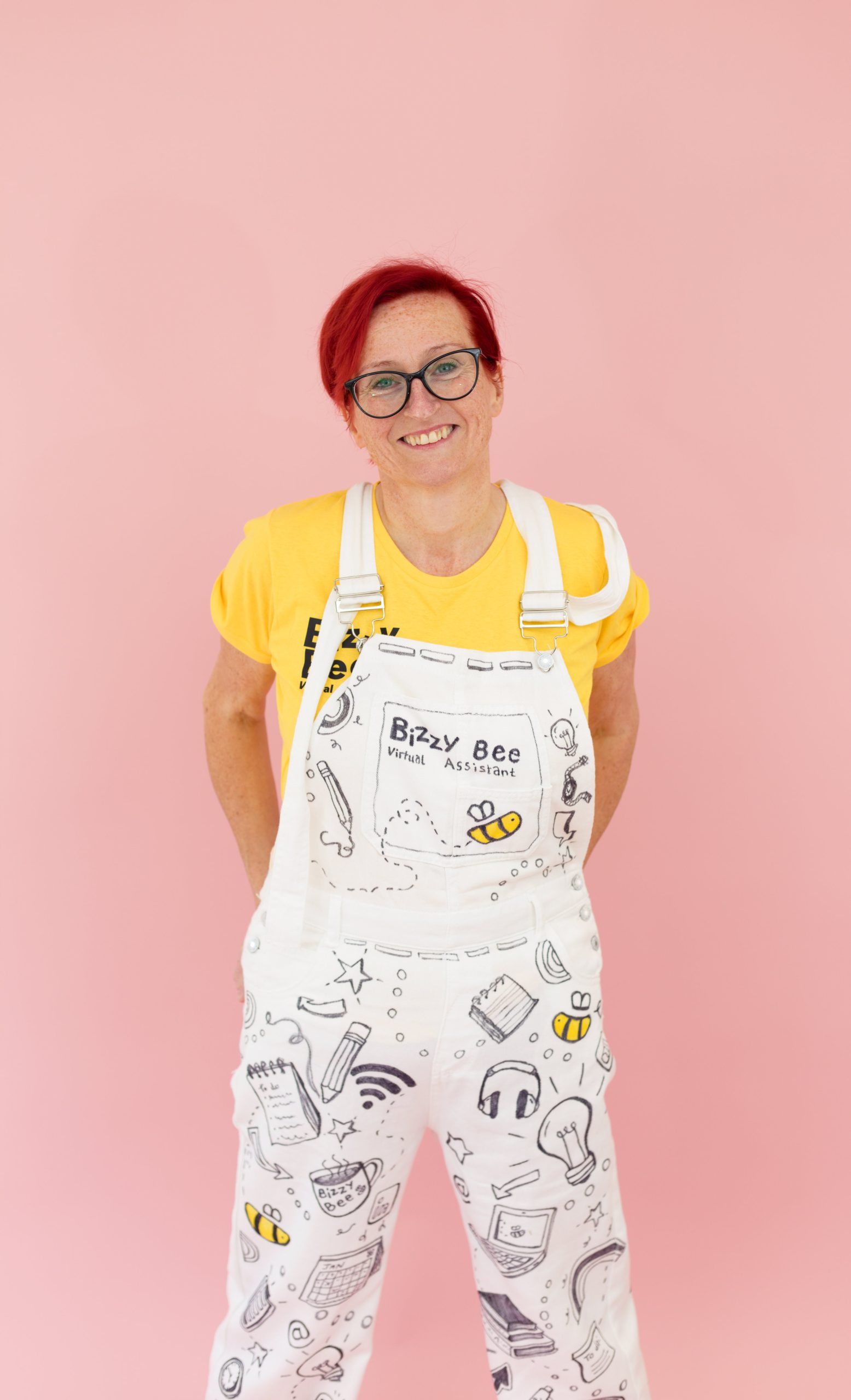
To add to the personality of the brand, I created a collection of hand-drawn illustrations personal to Erin, amongst others, there are glasses (modelled on her own pair), a laptop, phone and her famous dungarees! These all add character and interest to the overall brand identity.
Throughout the project, usability remained a key consideration. Erin now has a flexible visual identity that can grow with her business.
Jo and I had similar reasons for starting our businesses. Because she resonated so well with my values, I knew we’d work well together and I wasn’t wrong.
Erin Buck
Founder of ‘Bizzy Bee VA’