Barista Sista
Brand & Logo Design
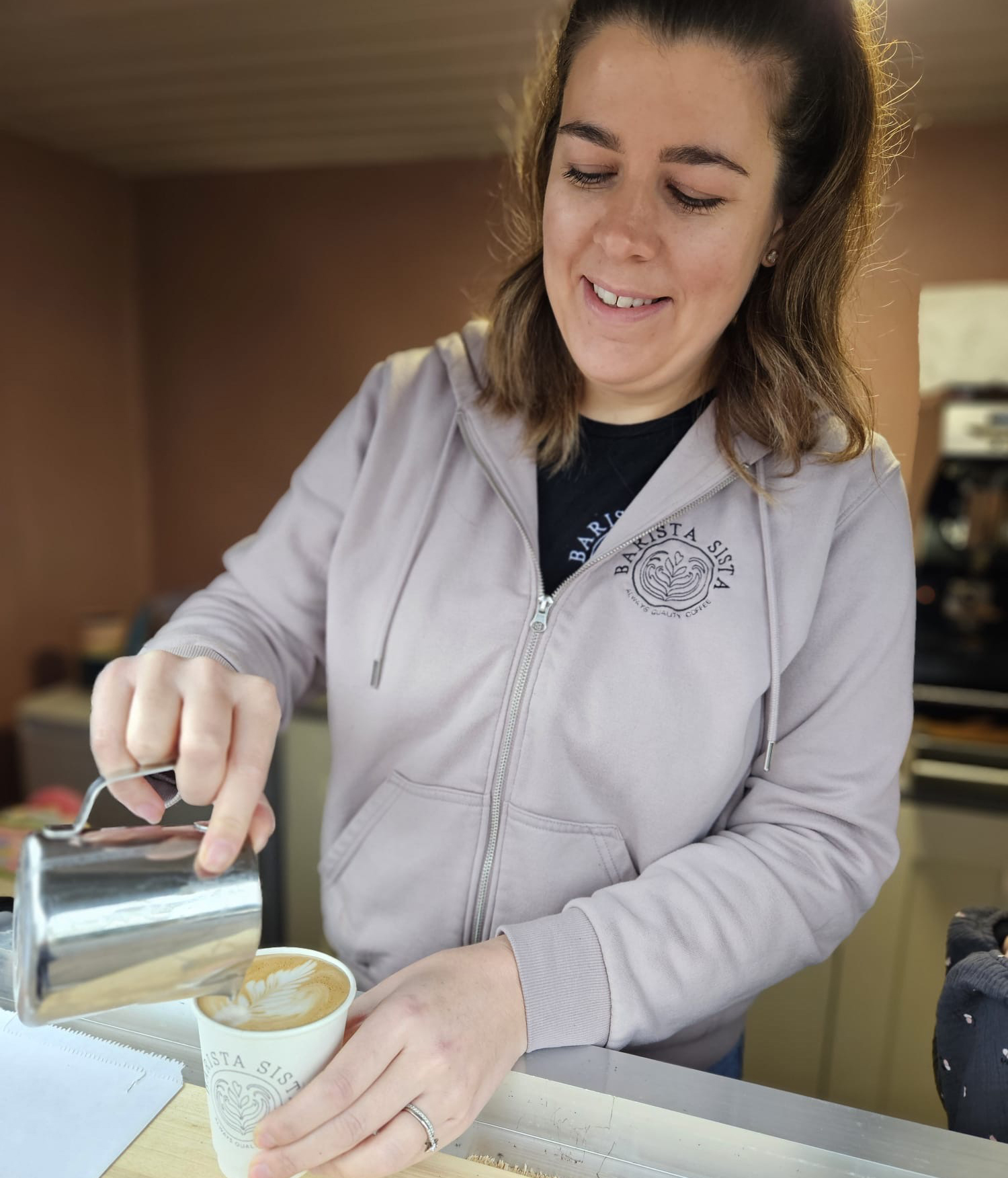
Sophie is a passionate coffee connoisseur, so when she approached me to create a brand for her new business ‘Barista Sista’, I couldn’t wait to get started. With her new business Sophie understood the importance of having impactful branding. She needed branding which would set her apart from the competition and allow her to make a professional and lasting first impression. I wanted to create a strong brand to get her new business off to a flying start. Sophie has converted a horse box serving customers in a regular spot as well as touring for one off events.
Creating Logo Concepts
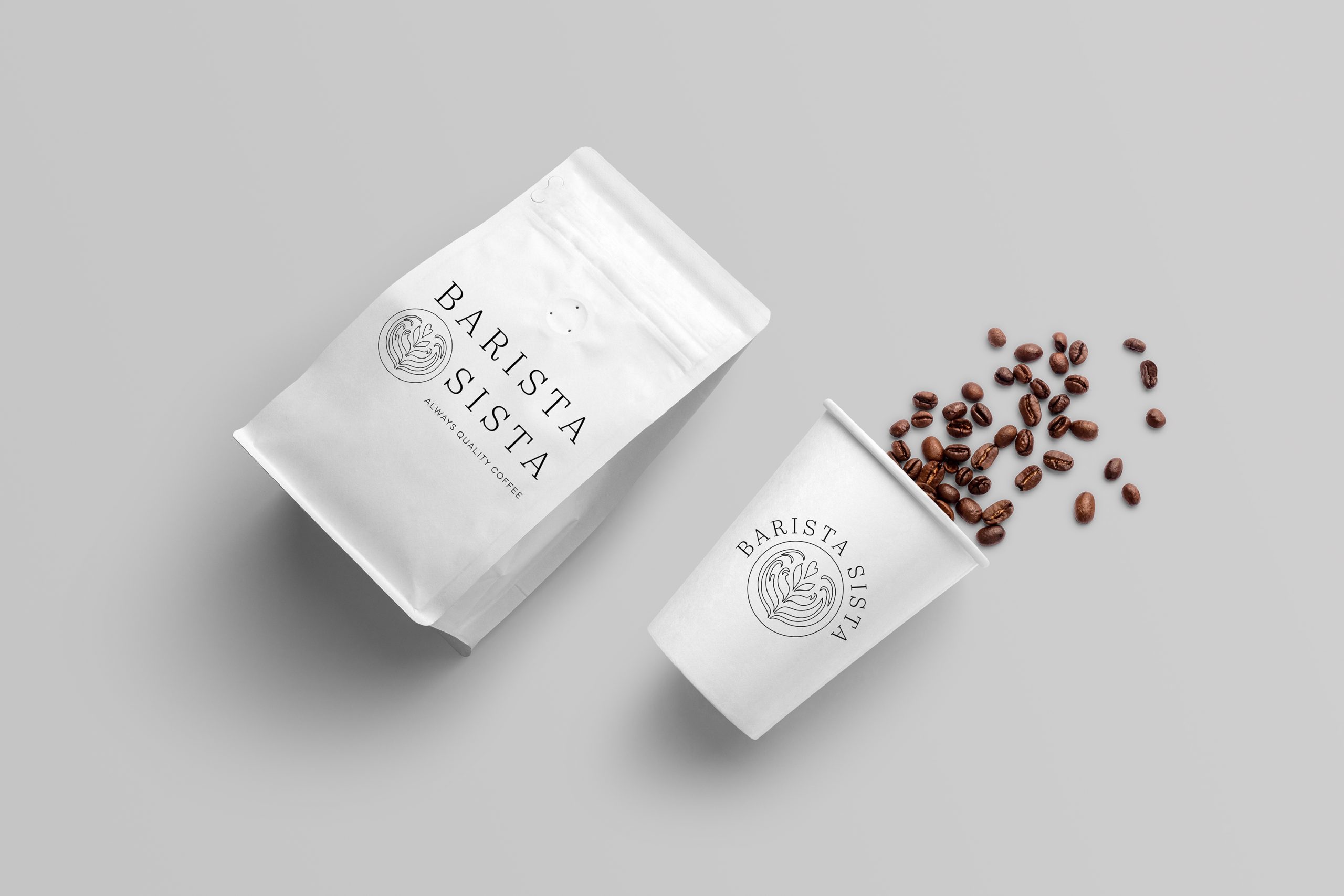
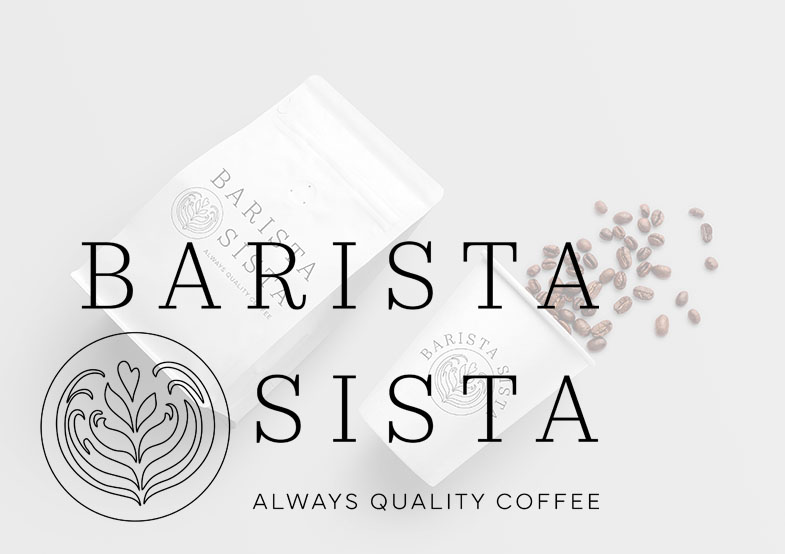
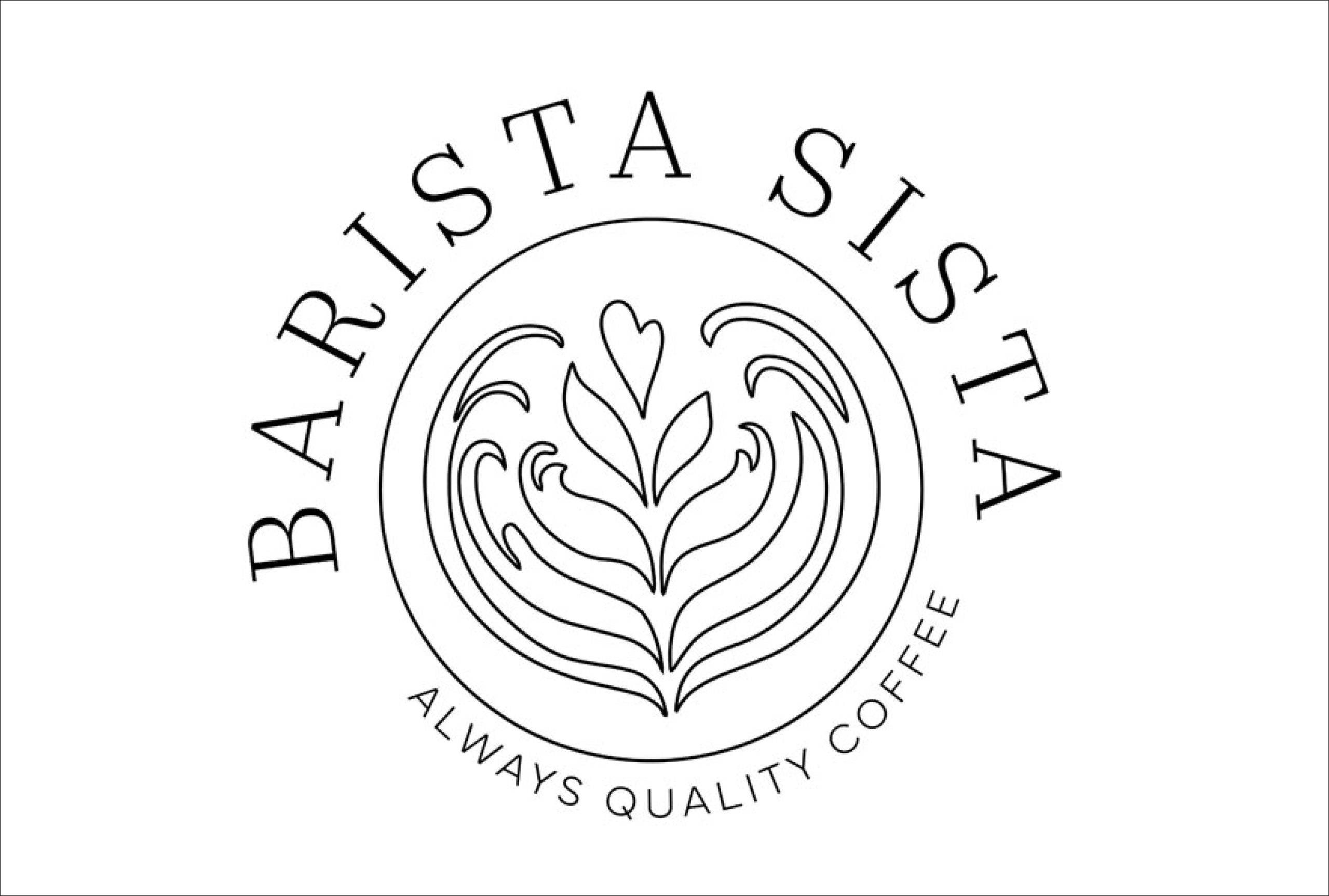
When designing a logo for someone’s branding, one of the many things I consider is how and where the logo will be used. For Barista Sista, I created several variations. Firstly, I designed a core logo, predominantly illustration based. This can be used with or without a strapline depending on the requirements. This is ideal for square or round spaces and large format printing.
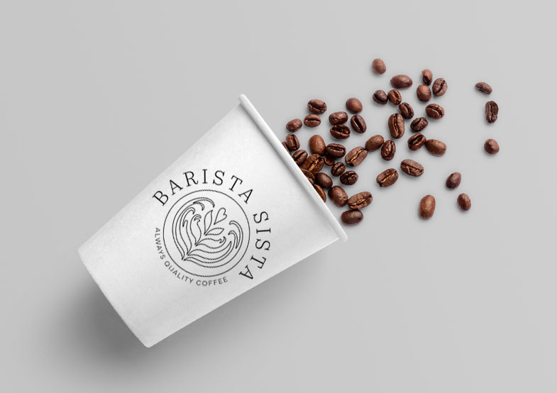
Following this I created a more text-based version to use, ideal for rectangular spaces and packaging. It is important to have a logo that keeps the legibility of the text clear in all size formats. These all work as a team to facilitate different uses.
Brand Colours & Fonts
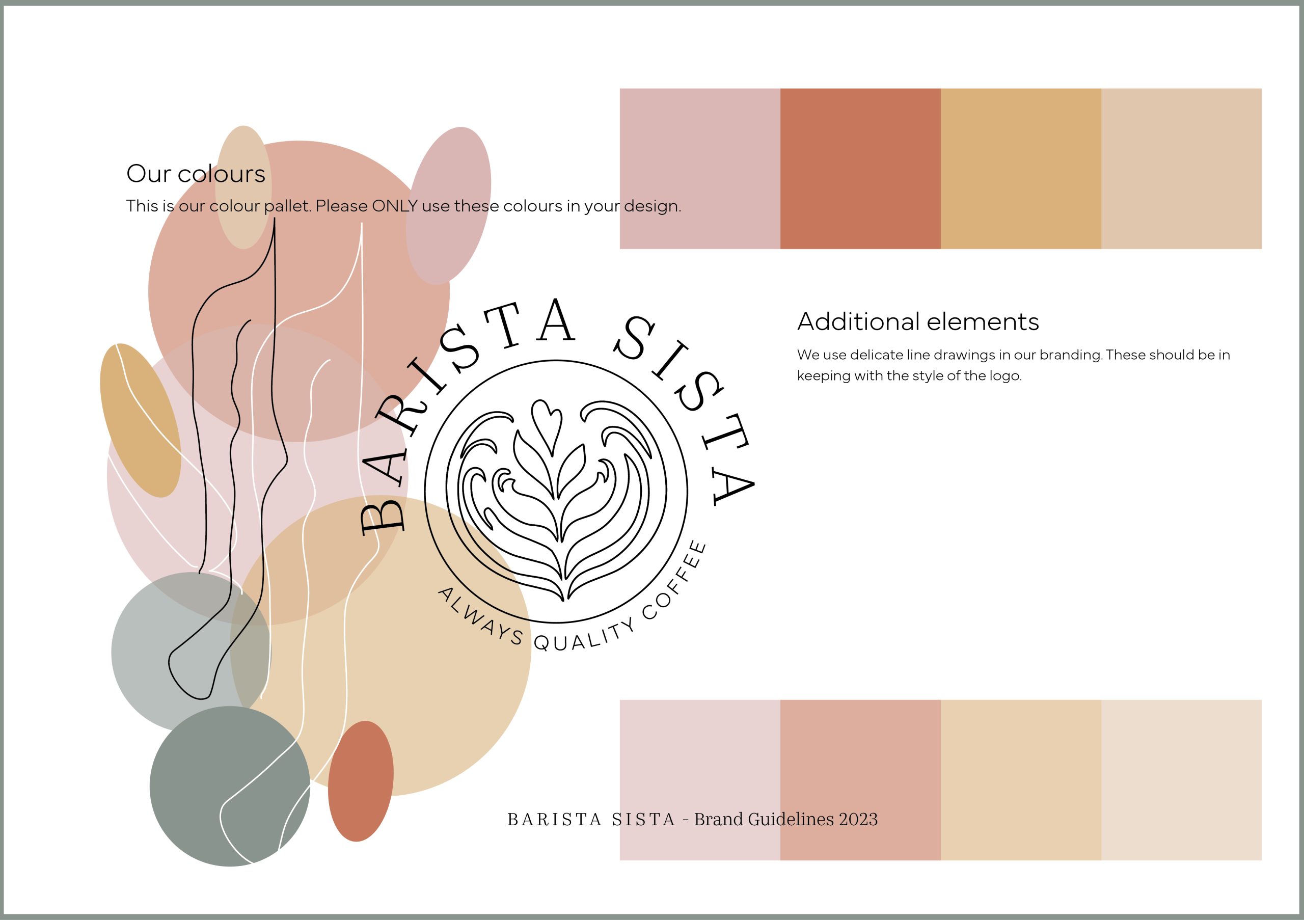
When it came to the branding colours, I knew we needed earthy colours to create a warm and approachable atmosphere. I wanted to keep Sophie’s coffee business away from drowning in a sea of brown tones therefore, I considered the colour choices very carefully.
I chose warm colours that represented various coffee-based products, leaning towards caramel, pumpkin spiced, and milky coffee colours. This colour palette represents a cosy and comfortable environment, encouraging Sophie’s customers to relax whilst enjoying their coffee. I added an earthy pink to reflect Sophie’s playful, passionate side, and an earthy green/stone colour providing some relaxing contrast to a very warm palette. As a result the palette is earth yet eye-catchingly fun!
In addition, I created illustrations that complement the brand such as line drawn coffee beans and other related items. These add another layer of interest which can be used in patterns and throughout her marketing.
Barista Sista had a very successful launch and continues to grow from strength to strength.
If you are looking for branding that really stands out, get in touch, and see how I can help.
Thank you Jo, for creating such a beautiful, strong logo for me using your expertise and creativity. You are such a talent and can’t recommend you enough!
Sophie Langran
Barista – Founder of Barista Sista
