Harriet Miah Garden Design
Brand & Logo Design
Harriet Miah is an award-winning garden designer based in Norfolk. Harriet needed a timeless, luxury feel to her branding and logo; reflecting the quality service of her fledgling garden design company. Harriet was keen not to use any gardening gimmicks within her branding. After spending time getting to know her branding desires, I created a timeless logo exuding class, mirroring Harriet and her business.
Logo Concepts
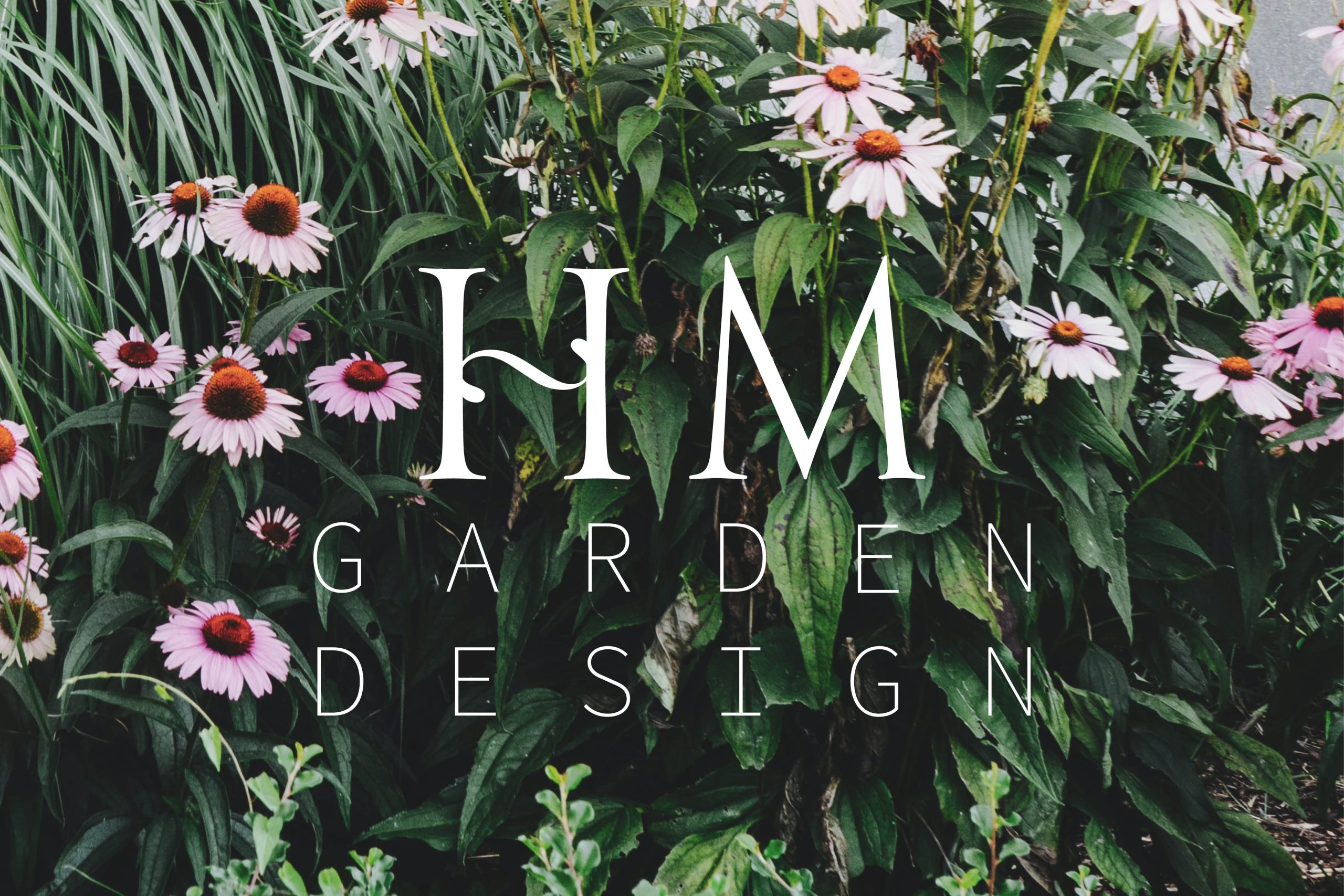
After the initial round of concepts, the final logo featured a luxurious font. A classic Serif, which has a timeless quality to it. I coupled this with a clean, thin, San Serif font to give contrast and represent the modern elements of design. These font choices were chosen to depict a garden through typography; the combination of hardscapes areas and strong structures, softened by plants and flowers.
As I was crafting the swirl shape on the letter ‘H’, images of iron gates found in stately homes came to mind. This small additional characteristic adds interest without being too obvious or cliché. It creates a sense of care and attention to detail, something Harriet is constantly doing in her own work as a garden designer.
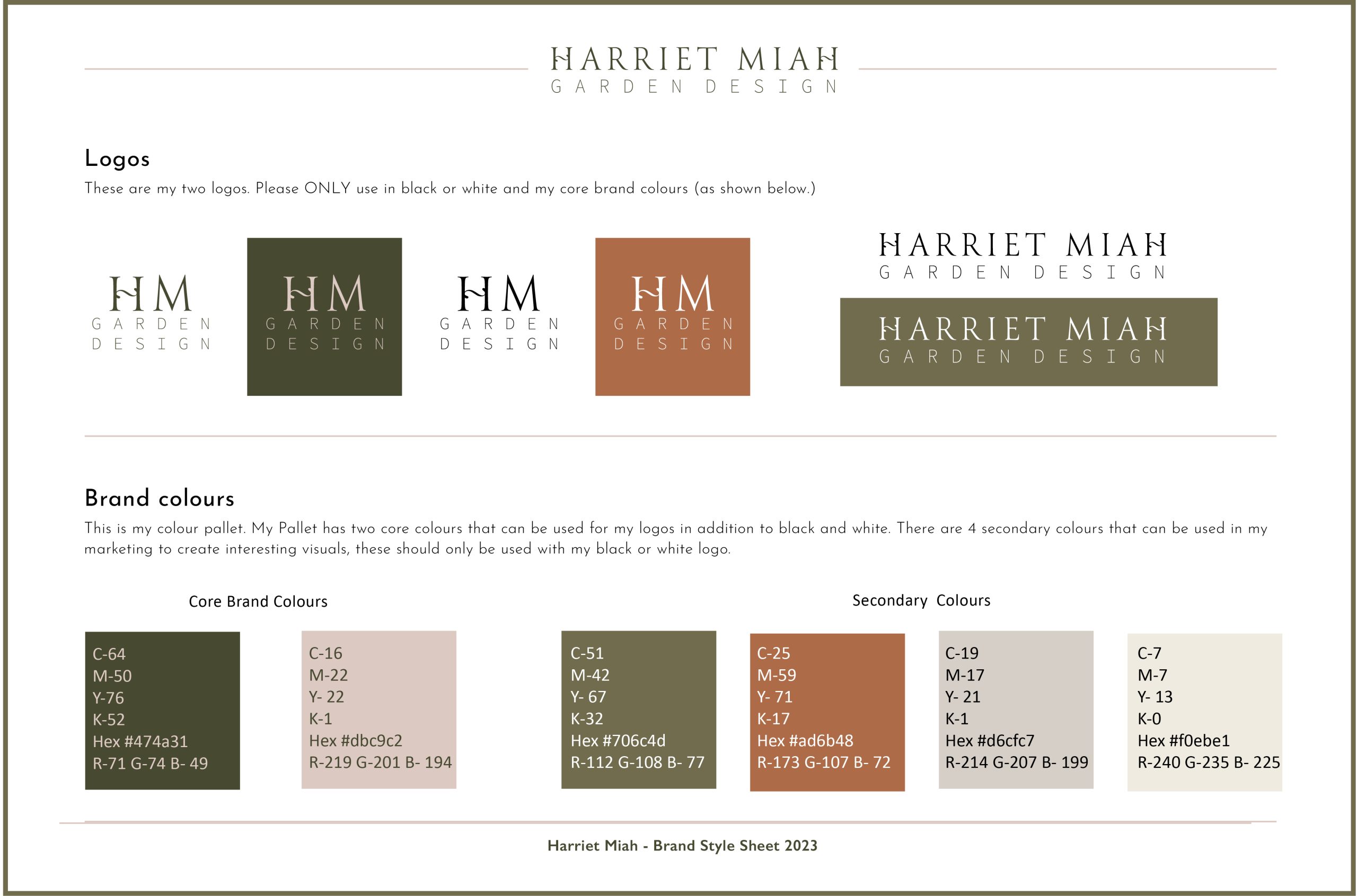
Having a collection of logo designs and colours in your branding is vital. I created a secondary logo for Harriet, giving her flexibility in her marketing. Harriet’s logos are designed to stand the test of time rather than following any current trends in logo design.
Brand Colours & Fonts
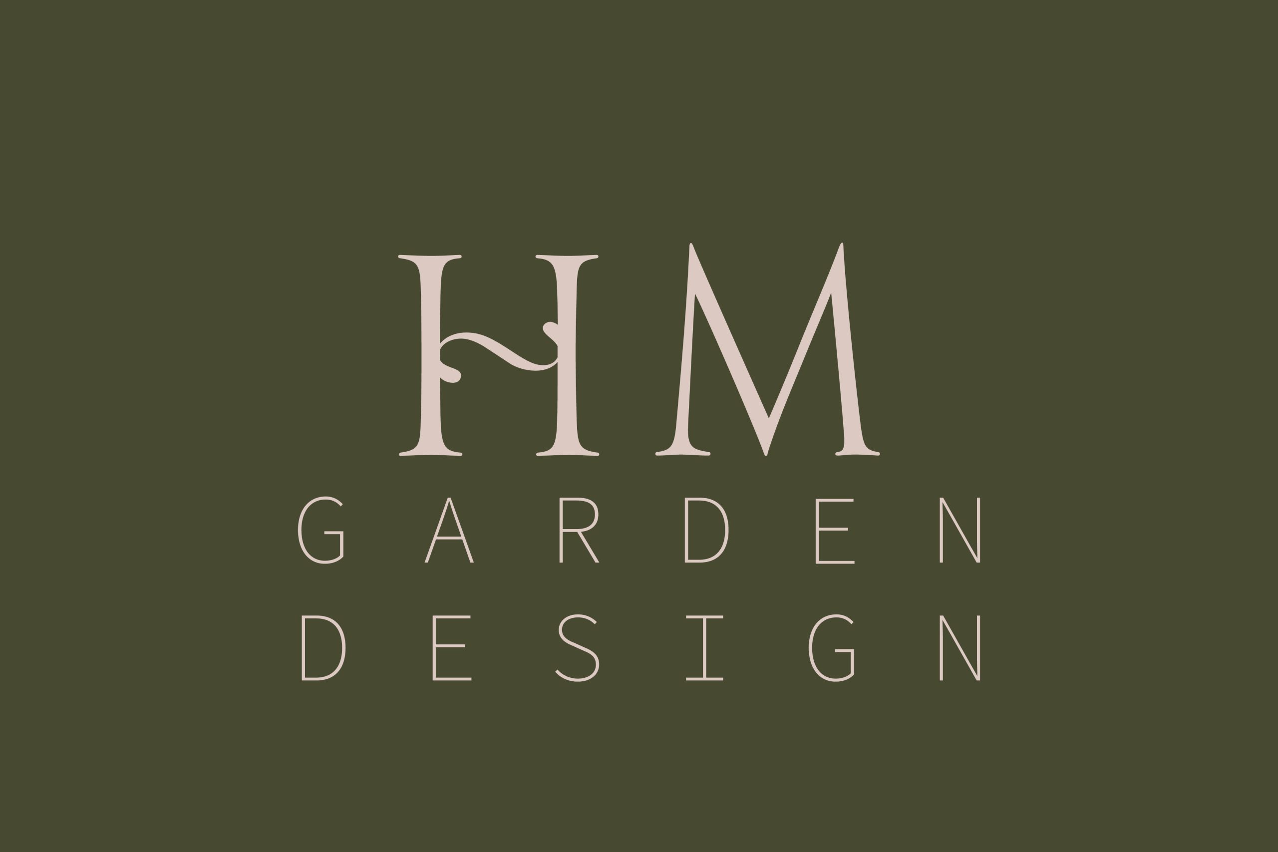
The colour choices in Harriet’s logo were very deliberate. The dark green represents foliage and the soft pink offers a lighter tone, echoing the hard and soft elements within a garden. Continuing the concept of the font depicting the contrasting garden elements helps to build and establish Harriet’s brand identify.
In addition to the core colours, I carefully selected four secondary colours to use in Harriet’s branding. They each represent a key element found in gardens; terracotta, grey, white stone and a lighter green to offset the darker green featured in the core colours. These colours allow Harriet to create cohesive marketing materials for future use.
Harriet’s garden design business now has tools which allow her to present her business in the best light and showcase the real quality of her services.
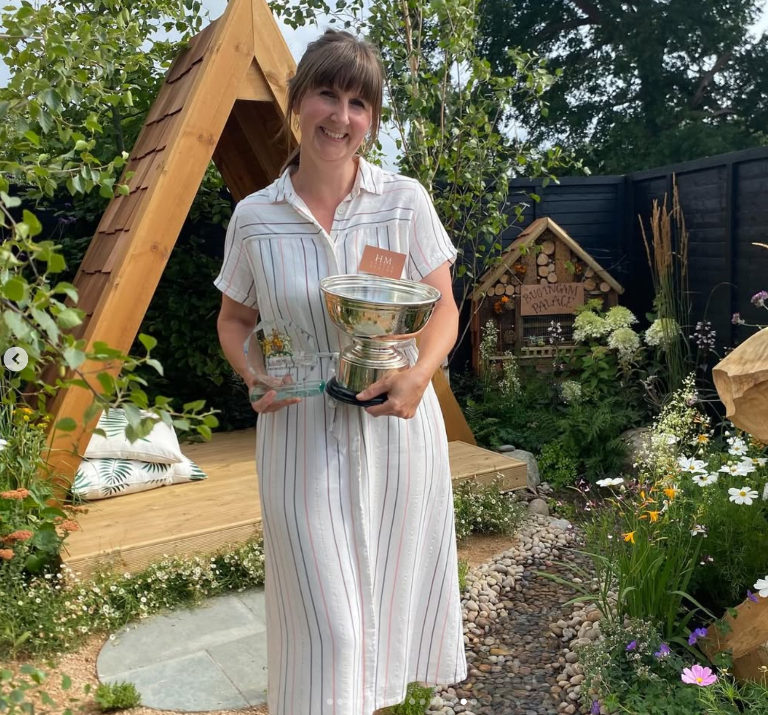
You’ve got a such a great eye for detail and gave me loads of good advice on how to develop my branding to the next stage. Looking forward to working with you again very soon.
Harriet Miah
Garden Designer
