Carter Hair & Make-up
Brand & Logo Design
When I met Holly of Carter Hair & Make-up, she was facing the common problem of lack of continuity in her branding. Holly is an award-winning bridal hair and make-up artist, offering high-end, quality services. However, her branding was not reflecting this. The lack of consistency was causing her frustrations! She wanted her marketing to look succinct.
Solving the Problem
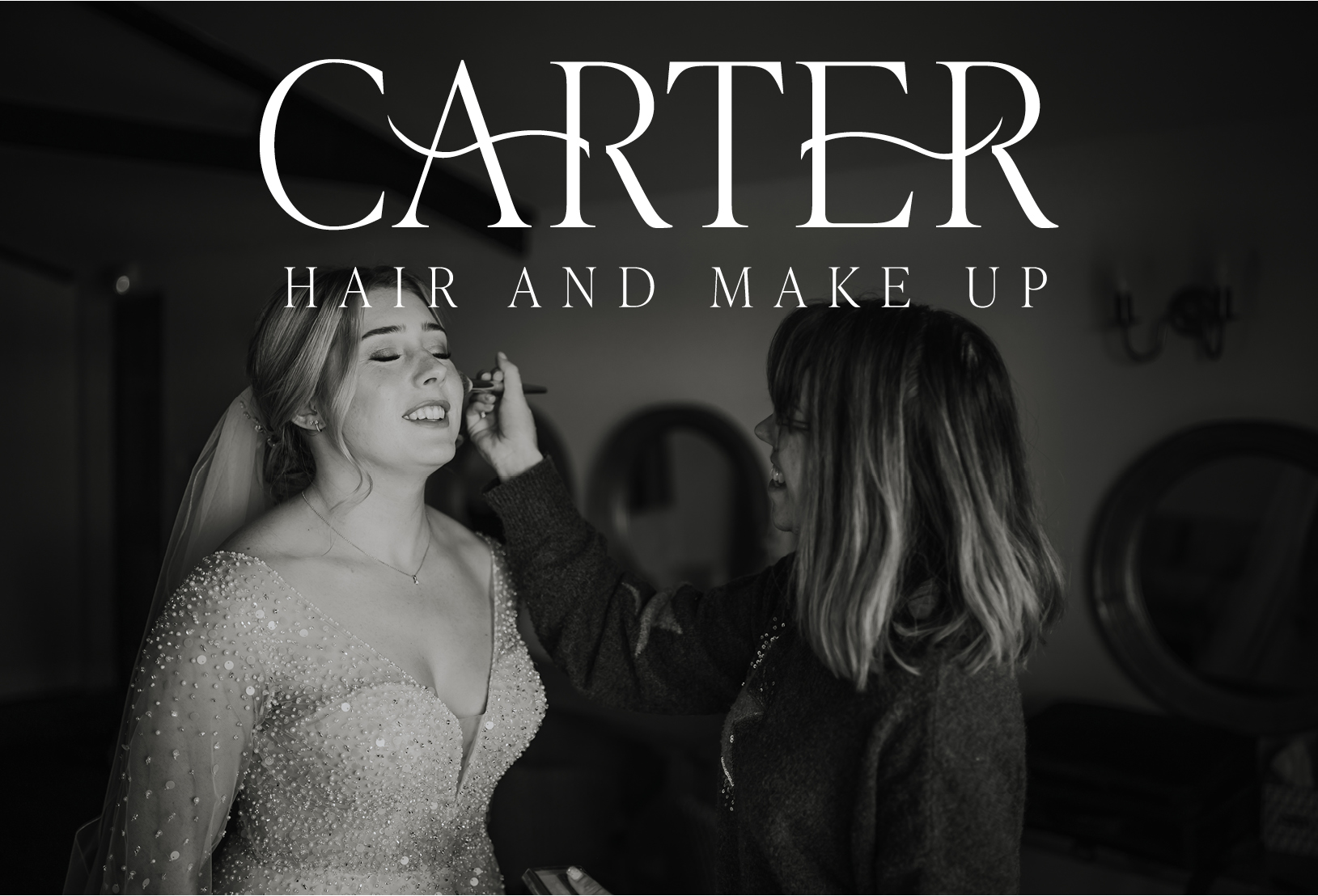
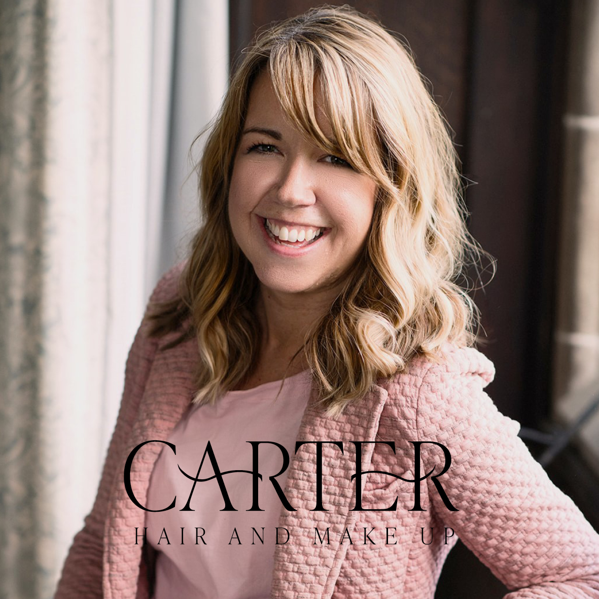
Holly has a great personality, which is her unique selling point. Her energy shines through in all her branding photos, I wanted her logo and branding to reflect that too. My goal was to give Holly all the tools she needed to create a consistent message throughout her social media channels, website and marketing. I wanted to create branding with a luxurious, yet friendly feel mirroring Holly and her bridal business.
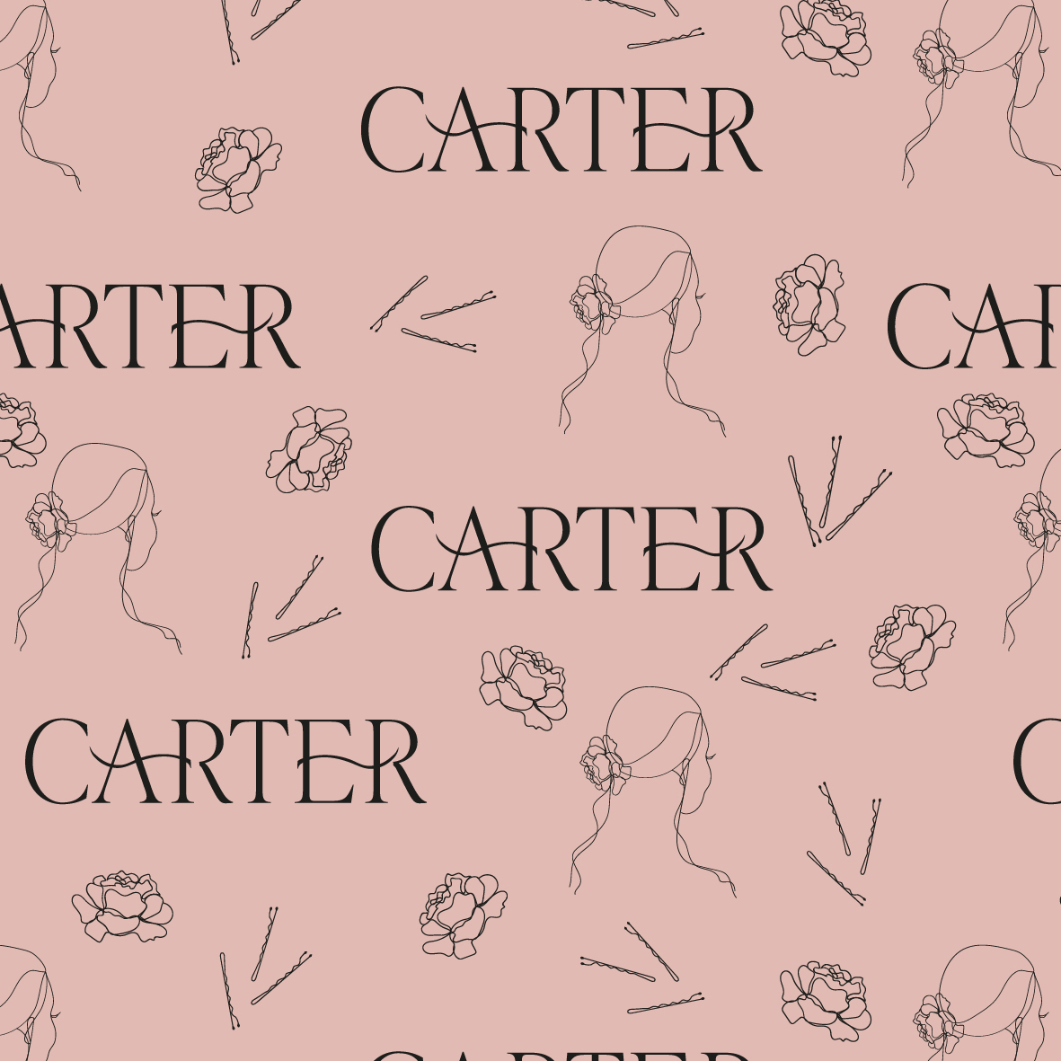
The concept for Holly’s logo is derived from a strong, yet elegant font. A font reminiscent of glossy, luxury fashion magazines. To add a touch of softness I incorporated natural, feminine curved lashes. This detail adds interest as well as being relevant to her service offering. Carter is a short name making it very versatile in terms of usage. Holly can pair this logo with or without a strap line, giving her flexibility of use.
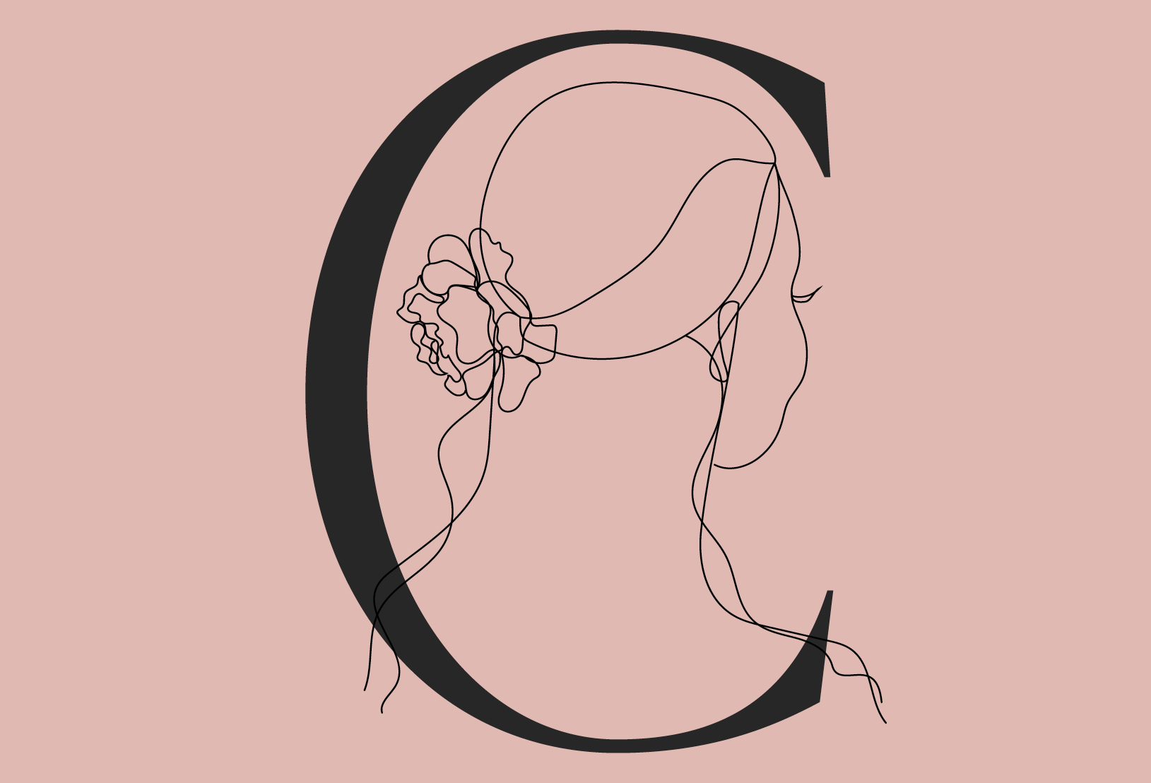
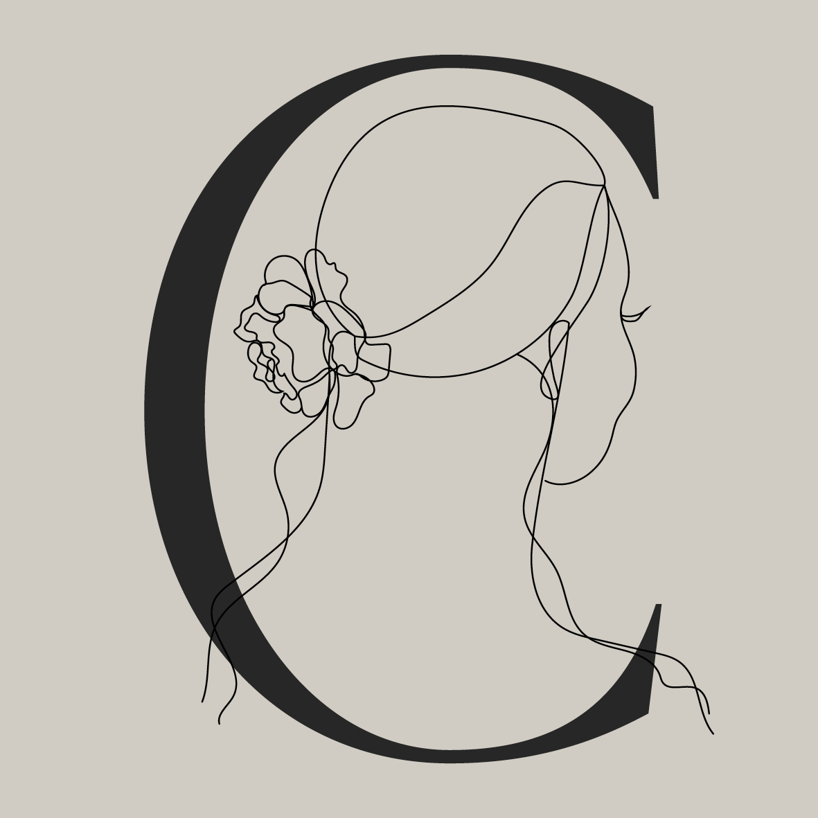
Once again, I created a secondary logo which can be used alongside the initial logo or independently. I provided Holly with extra bespoke illustrations; giving her flexibility in her marketing and softening the overall look of her branding.
Brand Colours & Fonts
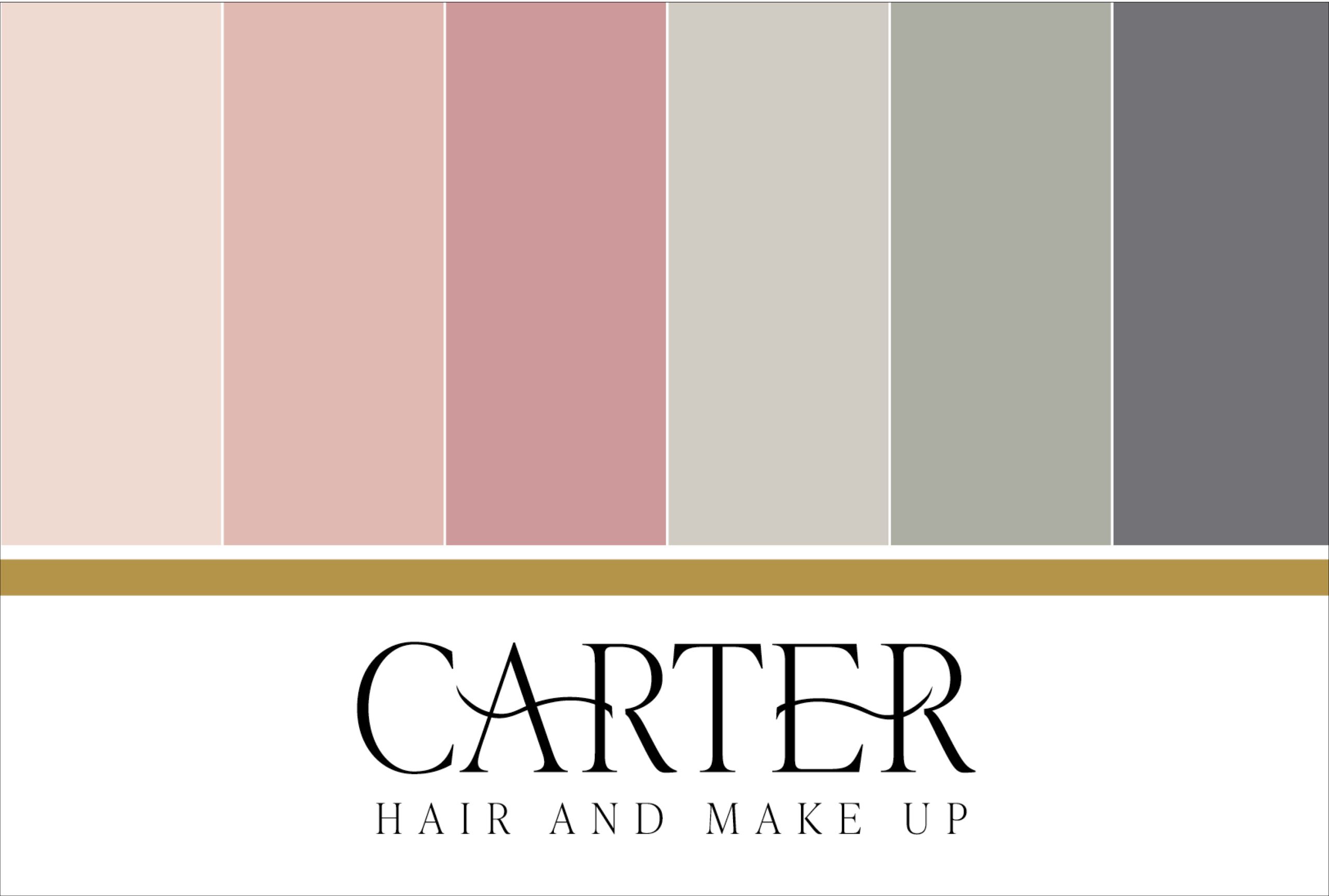
In the bridal industry there is a lot of pink! I was keen to give Holly a colour pallet that allowed contrast and created interest, using pastel colours that represent soft make-up shades.
I carefully curated a harmonious colour palette that truly complements the overall aesthetic. Using pinks for that feminine feel, greens to give it a refreshing, tranquil element and a dark grey to add contrast. This colour palette shows both sides of Holly’s personality whilst keeping the colours appealing to attract her dream clients.
When choosing brand font pairings I considered what would work seamlessly for Holly moving forward, allowing her to use them on her website and other materials. This re-brand has allowed Holly to create the continuity she craved, enabling her to attract more clients.
Are you looking for the same continuity in your branding? Drop me a message!

Her skill is second to none and she really gets to know her clients as well as their style for their business. Look no further for your design needs!!
Holly Carter
Hair & Make up Artist
