The Mind Oracle
Brand & Logo Design
Louise Demetriou approached me when she was newly qualified in Neurocoaching and looking for branding for her new business. Louise has a wealth of experience in corporate HR and was looking for a professional image that was reflective of her scientific studies of Neurocoaching and the professionalism she possesses.
She wanted to go out to corporations and help them implement the positive changes that Neurocoaching brings. The branding would need to stand up in corporate settings whilst conveying the nature of the service she is offering.
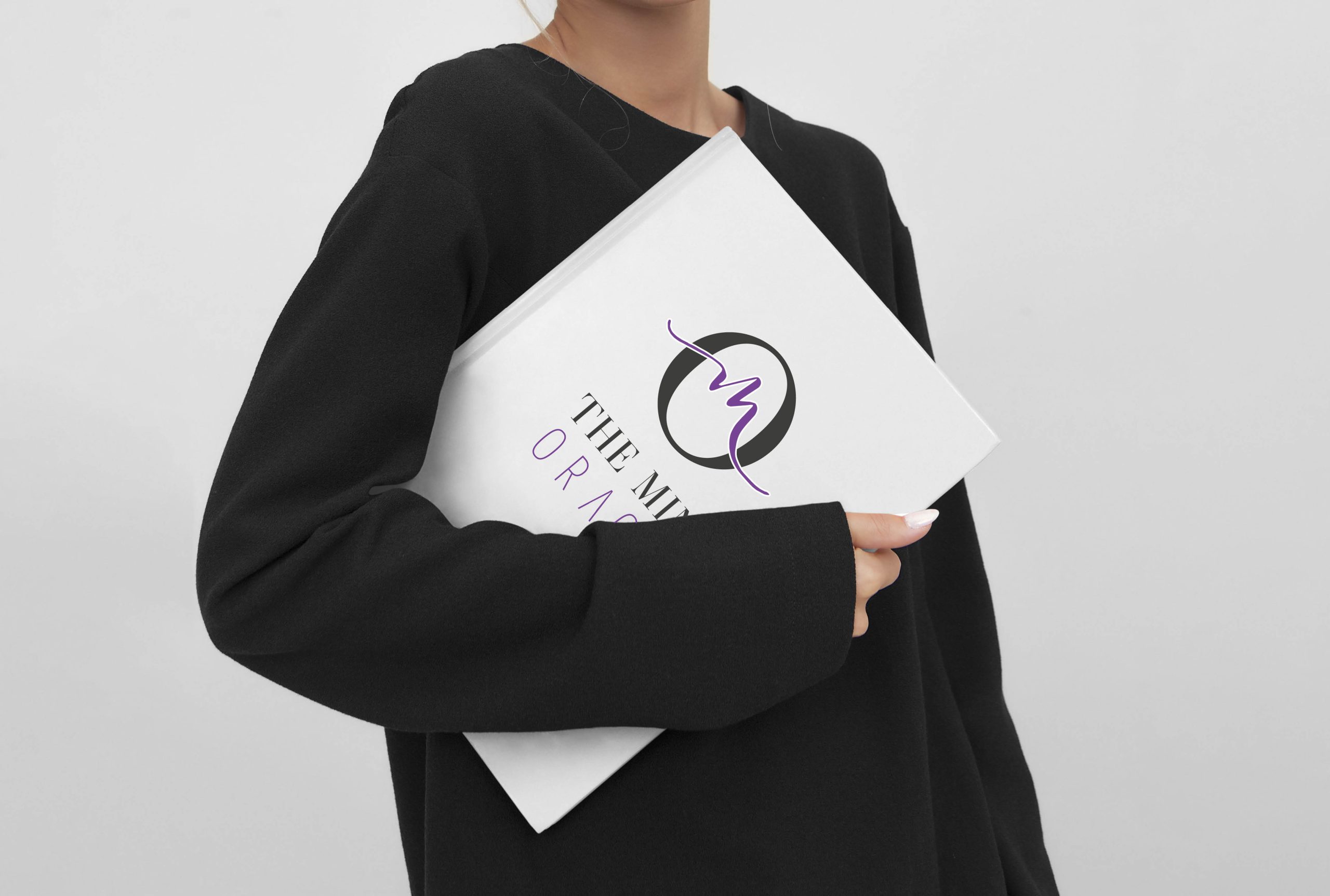
Bespoke Brand Design
I wanted her logo to be strong, interesting and professional, while representing this reliable service backed up by science. Louise needed to appeal to a variety of companies and managers so her branding needed to appeal to her clientele. Louise wanted to include a link to her Greek heritage as this company was personal to her and her journey.
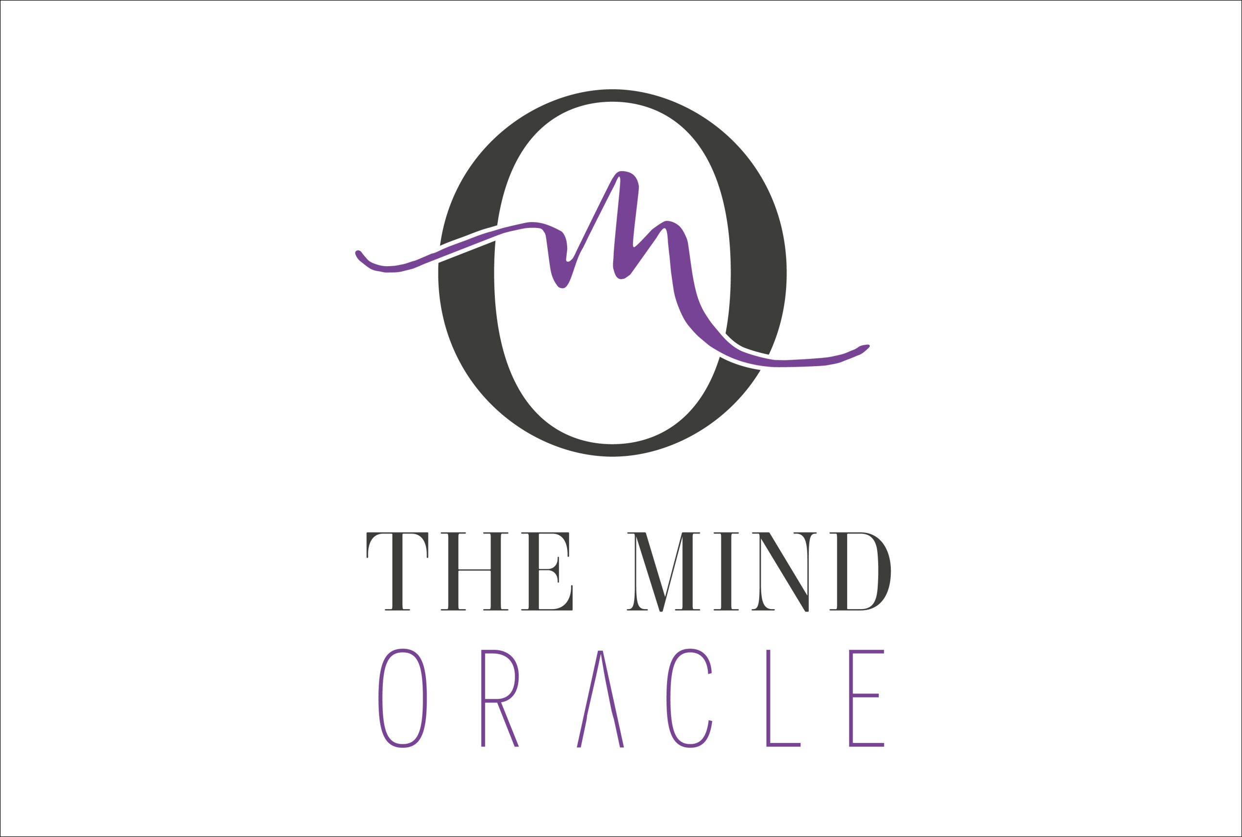
The chosen concept was a monogram of the letter M and O. I love using typography in a symbolic manner to create significance. The M for mind and O for Oracle were transformed here to represent the brain and its electrical connections.
As a nod to Louise’s heritage the font used for ‘Oracle’ was adapted to incorporate the ancient Greek symbols by adjusting the letter A.
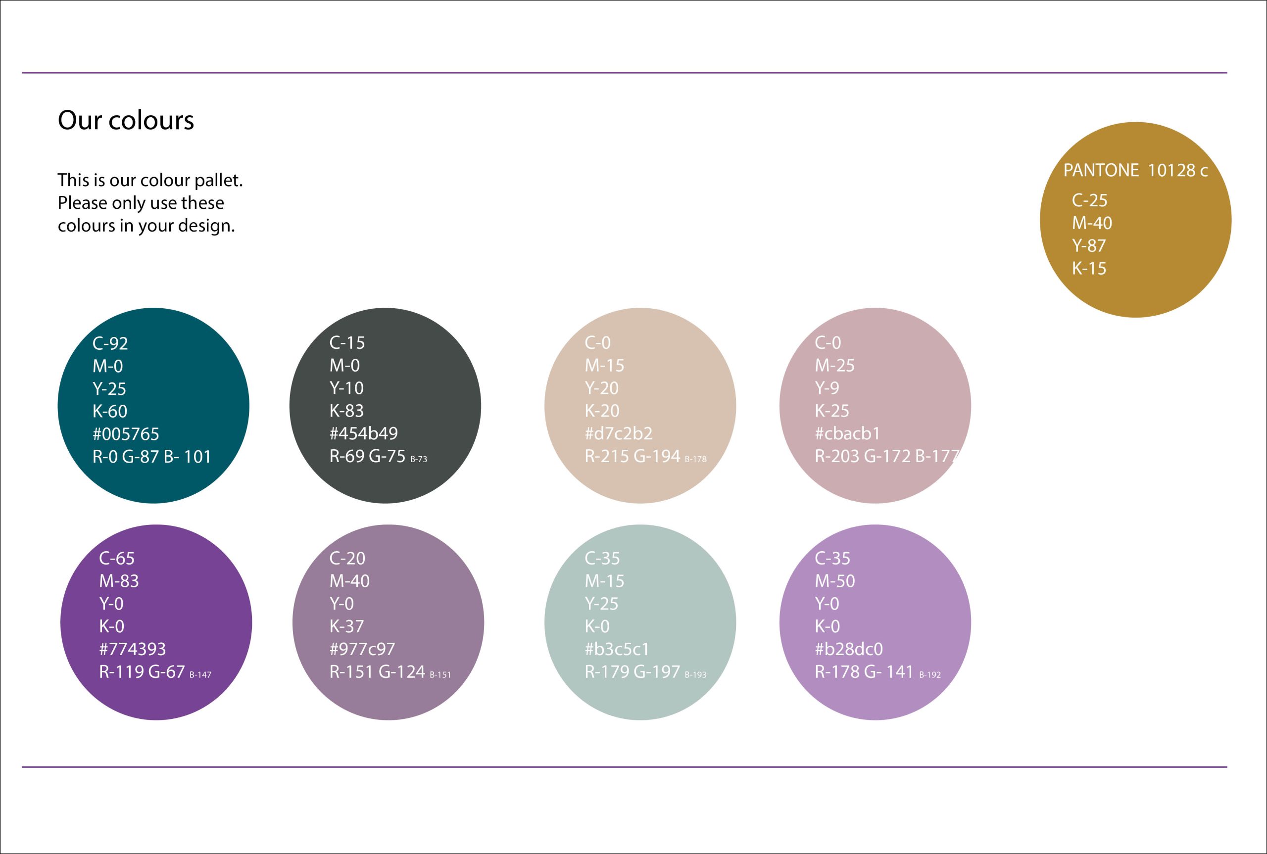
We chose a primarily purple pallet with a wide range of diversity options. Purple represents power and ambition; however I selected the pastel shades to give it a subtle edge. Equipped and empowered by her new branding, Louise continues to help many businesses and their employees with her work.
Are you looking for branding that represents your business and appeals to your ideal clients whilst giving you a clear voice in a busy landscape? I would love to help!
Jo asked all the right questions to understand what my business was, who I was, and what my motivations and aspirations were…. It was very difficult to choose and as such, Jo designed a logo pulling elements from a number of different concepts to produce a logo that is unique and powerful. I couldn’t be happier with the end result!
Louise Demetriou
Neuro Coach & HR Specialist
