That Little Bookshop
Brand & Logo Design
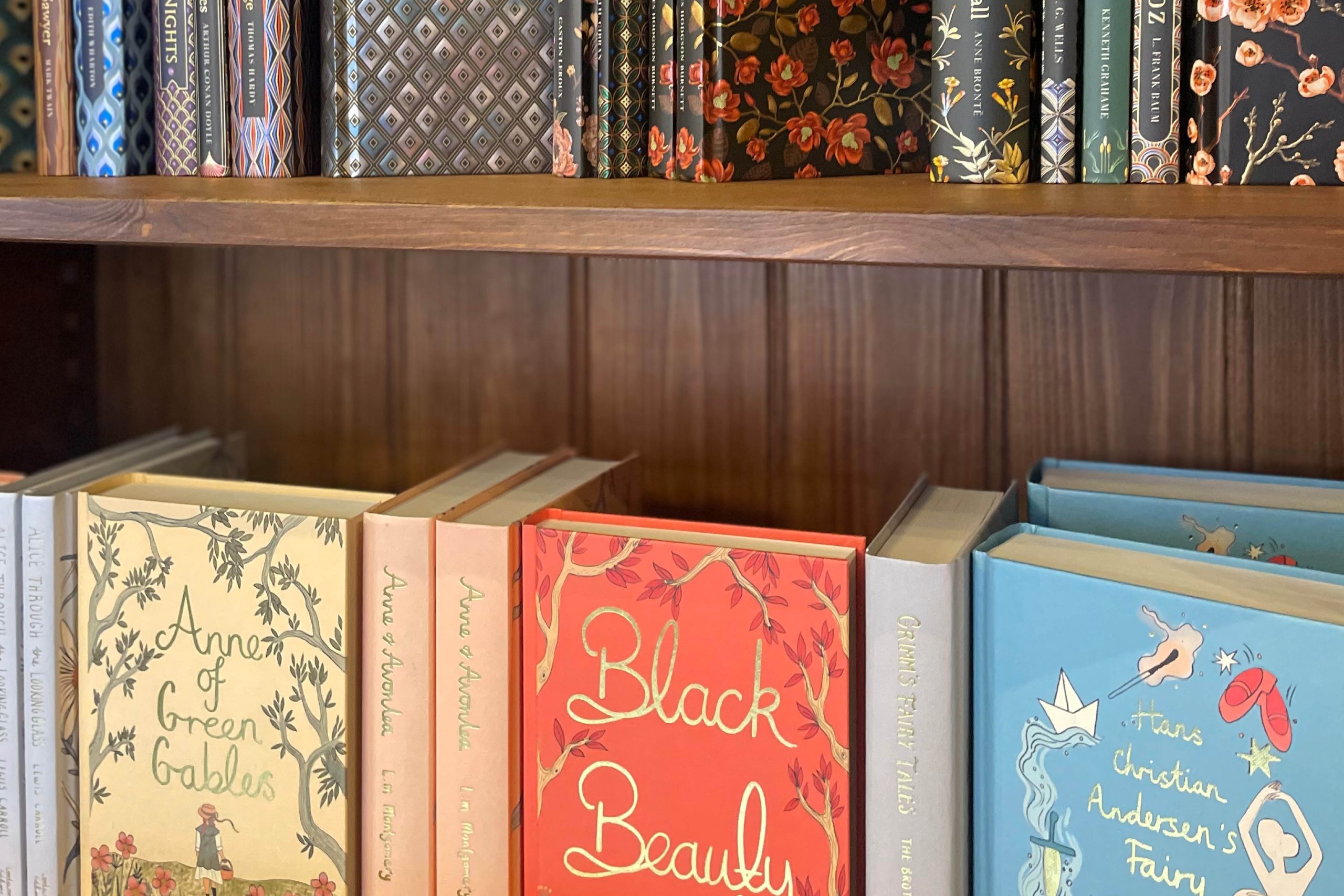
Cassie, the heart behind ‘That little bookshop’, had a clear vision: a brand that captured the warmth of a traditional bookshop, wrapped in cosy comfort with a touch of magic. She dreamed of a brand that would work seamlessly across her online store, pop-up events, and eventually – her very own physical shop!
One of the most rewarding parts of creating brand identities is seeing the impact they have on a business. From the initial concept to supporting Cassie with materials for pop-ups, signage discussions, and the exciting opening of her new shop. I’ve loved being part of this journey.

Bringing Branding To Life
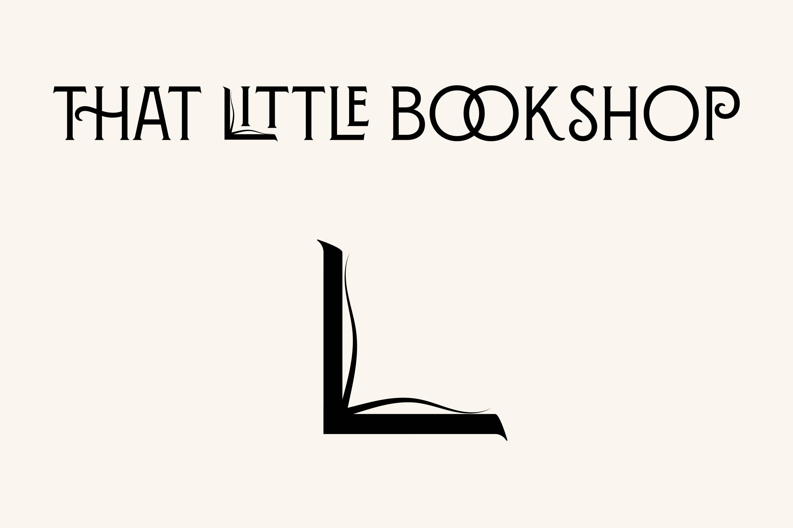
I chose the font for its characterful lettering with flourishes that add a little ‘magic’ and make it feel like an old spell book. I utilised the quirks of this font by incorporating some of the flourishes within the writing not just at the start or end. I hooked together the double ‘O’ in the word book to give a sense of connection.
In addition, I manipulated the first ‘L’ in the word ‘Little’ to create a ‘book’ symbol. This can also be used in isolation as a ‘logo Icon’ – Logo icons help to create quick brand recognition.


The Result
The attention to detail by Cassie, has been paramount to the shop’s success so far. The ability to communicate the new branding for ‘That Little Bookshop’ consistently, has allowed a clear sense of identity and fitted into the incredible vision Cassie had for the shop.
To watch this beautiful business come to life with the local community firmly behind it, has been an honour.


Thank you so much for these and everything you’ve delivered.
It has truly been a fabulous experience working with you on what was a very daunting prospect for me and has been so easy, right from the beginning.
Cassie Gerrard
Founder of That Little Bookshop


